Blog
Update – February 27, 2018: We released Particles v2, which comes with customizable webfont and optimized icon collection. Check it out here.
Ever since the first cave painting, humanity has enjoyed a very natural means of communication that is now the imperious motif of our society, through strong, vivid colors, shocking imagery, iconic designs, and perfect ubiquity. Its presence cannot be reduced to dormancy–it’s quotidian, and it’s actively used to express ourselves and understand the environment and the ones around us. The way we dress and look, our gestures, the selfies we take, the things we post online, all fall under the same generic term, visual.
And it so happens that the vast bulk of interaction that takes place between man and machine is facilitated by none other than visual communication itself. Text, visual structure, color and contrast, and, last but not least, semiotics are the knobs and handles of every modern computer, which is exactly why we ought to treat these visuals as the means of communication that it actually is before trying to build any kind of identity on top of that.
Because of the substantial meaning, some of them can convey and also because of their effortless comprehension, icons deserve their time under the spotlight. Throughout this article, we will cover the importance of using icons on the web and a manner in which you can create your own icon set that strives to be both consistent and effective.
Before diving into any of the details, one question should arise, and it should tackle the actual utility of icons in human life. They’re everywhere, and we’re so accustomed to them, but are icons indeed necessary?
A very simple and insensitive answer is no. We don’t need visual aids to give us information that words and punctuation have already mastered. At the same time, we don’t need to use icons in order to spruce up the looks of something since there are so many other visually pleasing elements that can be used. Icons are obviously not a necessity, but they do have quite substantial benefits.
The crucial aspect of icons is the fact that they’re notably easier to understand than their text counterparts. Here’s a great example of how simply seeing an icon requires so little effort on the brain’s part in comparison with having to read some words and conjuring up an image in order to understand it, something that comes by default when using icons.
vs. Ethernet Socket
Continuing with these advantages, another point that brings the odds in icons’ favor is the fact that in a lot of cases they use far less space than even one single word, not to mention multiple ones.
vs. Fast Forward
It might have gone unnoticed, but, until now, all arguments are relying on the reasonable assumption that these icons are easily understood by each and every person seeing them–they have to be common ground in order to be understood. Just like in the case of a language, icons are affected by our cultural backgrounds, and anyone can interpret one in his own particular way. Now, the reason why icons do carry their proper meaning, and they’re doing it in the most diverse of habitats which is the web, is because of prior exposure.
In order to illustrate this phenomenon, let us take a closer look at the iconic media control symbols that practically everyone is familiar with and see where they’re stemming from.
Out of all the media controls, record is the one that sets itself apart, as it does not control the current media that’s handled by the program or device, but future media that is to be recorded. This particularity is also graphically noticeable with the help of its round shape and attention-grabbing red color.
Nevertheless, if we were to leave its familiarity aside for a few moments, it may not occur to us where this symbol drew its inspiration from since the symbol itself is most probably our visual representation for the act of recording and not the other way around. As refutable and contestable as this can be, the most probable source behind this symbol is the red light found in cameras while on air.
The reason these three are grouped this way is their direct connection to cassette players. Cassettes have a natural direction in order to play sound properly, and this is emphasized by play’s rightward-pointing, arrow-resembling shape. Rewind and fast-forward use a secondary triangle to stress speed apart from direction.
Stripped of its connotations, the pause symbol does very little in terms of communication. It’s formed of two vertical bars which may symbolize disruption, stop, but the most probable explanation behind it is the caesura which is most often associated with music notation where it indicated a complete pause.
Out of all the media control symbols, the one meant to be used to stop the current action is probably the most abstract and the hardest to find any reasoning behind. You may argue that the square may be just as good a shape as any other to suggest halting, but one plausible hypothesis would be that it was inspired by the squared variant of the full stop which is the British variant of “period”.
Media control symbols are a perfect example of creating icons for specific needs and teaching people this new language. Would you ever imagine a music player with the words “Play”, “Pause”, and “Stop” being used instead of these icons? Probably not, and that’s because you thoroughly grasped this visual language. And this is precisely the reason why an icon should try to stick to some predefined visual identity if it already exists.
When it comes to adding that bit of flavor to your website, a harmonious, distinctive icon set can make all the difference in the world, as long as there is no interference with its prime objective, which is to deliver information. A particularly merited example of a representative icon set can be found on GitHub’s repository page.

In here, GitHub manages to not only teach the user about a couple of new icons (like the Pull Request), but it also makes sure that every little part of their interface screams–with a tender, playful voice–their melodious branding.
Nevertheless, apart from providing us with a show of their decorative utilization, GitHub also knows when icon’s meanings are diminished and shouldn’t be used.

Although they’re supported on by and large every single web browser that a sane individual would use in a year as modern as 2015, when designing a somewhat hefty icon set, you might end up drawing the conclusion that the PNG is Probably Not Good.
From a technical standpoint, the vector-based icon font will stampede over the raster-based, filtered PNG. Take a look below to see what happens when zooming in on the little icons and see the difference yourself.

Apart from the not-so-pressing issue that quality poses, there’s also the usually greater size that PNGs carry. Without a doubt, this can become a pressing issue if you have millions of daily visitors and a larger set.
And let’s not forget the fact that icon fonts provide a great way of keeping everything together and also make development and reiteration far smoother.
When setting out on the path to creating your own icon set, you should first thoroughly consider what your aim is and what you are trying to achieve with it. This will usually help you strike an original tone for the whole thing and also give you a hint about which icons you will need.
The thing is now not to get all excited and start spawning icons until your creativity sack runs out of ideas, for it will do it, and it will happen before the icon set is complete. A more thoughtful approach would be to divide the set in categories, with each category not exceeding 20-30 icons. Evidently, this is nothing more than a rule of thumb; it is paramount that you actually structure it in a way that best works for your project.
To best exemplify the actual creation of an individual icon, let’s start off by creating the first icon. We’re setting out to create an envelope, and we’re going to use Adobe Illustrator CC to accomplish this task.
Now, open a new document in Illustrator with the below-specified dimensions. Make sure that the Align New Objects to Pixel Grid box is not selected, as this may cause pointless issues further down the road.

With your new document created, access Illustrator’s preferences and select the Guides & Grid panel. You should set here your Gridline settings to match the size of your document in a way that each increment corresponds to 1 pixel of the grid, creating a solid ground for you to work with.

At this moment you may want to set your objects to snap both to the grid and to other objects. If you plan on attaining accuracy throughout the whole process, these settings will be the key to keeping everything in place.

By now your document should be all set up. Rename your current layer to “Security Margins” or anything else that’s suggestive enough and, with the help of the Rectangle Tool, define a security area whose purpose will be to isolate your content. The 1 pixel security margin around the artboard will keep the icons centered when the time comes to export them and shouldn’t be crossed.

To define our grid system guidelines, we start by creating a new layer that we can call “Guides”, and then we continue with drawing a set of lines that divides our work area in 9 equal squares and a circle whose diameter encompasses all the 4 intersections. These lines don’t need to follow any specific rule because they will be converted to guides anyway, but it’s wise to set their stroke width to 0.1 pixels and verify if all the lines are properly aligned to the grid (use ⌘+Y or Ctrl+Y to view on wireframe mode).

Proceeding now to the scaffolding of our guidelines, we will create the basic geometric shapes that will be the foundation shapes which the icons will adopt. In this case, our geometric guideline shapes will have 2 pixel rounded corners. Establishing this value on the grid will bestow all further shapes–when possible–a rounded character that is desired for the final look of this icon set.
The measurements you should adopt are: 21 pixel radius for the circle, 19 pixel side for the square, and 15×21 pixels for the rectangles.

With all the shapes selected, access on your main menu: View > Guides > Make Guides, or just press the correspondent shortcut (⌘+5 or Ctrl+5). The outcome of this action is to create some clean guides to which your future objects will perfectly snap to.

Create now another layer that will be your working layer, and lock the ones below to prevent inadvertent changes. If you followed the given instructions until now, your Layers panel should be similar to this:

Now that we have everything done, let the actual design of the envelope commence. We start by grabbing our Rectangle Tool and following the horizontally wide rectangle contours. Use a black stroke line of 1 pixel weight aligned to the interior of the shape and then select it with the Direct Selection Tool (A). By double-clicking the circle appearing on the corners of the rectangle we can select radius for rounding the corners. Use the suggested values in the image below if you want a similar result to ours.


To define the lower fold of the envelope we will draw a line that resembles the one in the image displayed below, paying attention to the equidistance of the points and the adherence to the grid and guides. To ensure that the stroke wholly covers the other objects, we may need to extend it a bit, for which effect we just need to use the Projecting Cap from the Stroke Menu.

To create the upper fold of the envelope, we only need to select the previously created object, copy it (⌘+C or Ctrl+C), paste it in place (⌘+F or Ctrl+F), and rotate the shape 180º. To create the rounded tip we proceed as before, applying a 2 pixel corner radius to the angle corner.

We will now transform all these separate strokes into an individual object. For this effect, we will select all the strokes and then convert them all into shapes by using Outline Stroke. (note: At this moment you may want to remove all the white color filling the objects you might have as this will facilitate the flattening process.)


With all the objects expanded, it’s time to fuse them. This will be done in two phases. First up, we will Divide the whole elements (Pathfinder > Divide) and then Unite them all together (Pathfinder > Unite).


If everything went well, your shape will be a single, flat element. You should always check, by expanding your layers menu, if the shape is properly flattened. You know you hit gold when, if, after expanding your working layer, you can only see one compound path sub-layer underneath. In case you end up with more shapes, try to delete them by hand if they don’t change the overall appearance of your main object, and, perhaps, play a bit around with your pathfinder to fuse potentially missed elements.

Your icon is now ready to export. Given the fact that we created security margins and guides, if we export the file like this, all the elements will be included, including the guides. This is why we will keep the actual file as a workbench for drawing icons, and we will create a new one dedicated to exporting our final objects. So, let’s create another file, similar to the one we made in the beginning of this tutorial.

At this moment in time, you might want to rename your artboard (Shift+O) to the category you plan to keep this icon in. For example, if you are drawing general objects, just rename your artboard to “Objects” for all the icons fitting in this category.

We’re now ready to export the icon, and we are going to use the SVG format in order to do so. Click Save As and select SVG on the File Format menu. Simply name your file 01 and always choose to export the artboards. This is when the artboard renaming comes in handy. By naming your files in order (01, 02, 03 etc.), Adobe Illustrator will always append the artboard name after the given file name, resulting in something similar to 01_Objects.svg. You may ask yourself “Why not name the file according to the icon?”. You’ll get an answer soon, but for now, you should keep this naming convention with icon names having numbers and being divided into categories.
The parameters described in the following image will give your file all the attributes we’ll need in the future.

To compile and render our beloved icons into an icon font, we will use a web application called IcoMoon. This free application has robust mechanics and will guarantee the quality of our final work. Let’s start by opening the website and accessing the application pressing the red button on top.

After this, create a new project.


You’re now ready to start importing your material. The interface is pretty straightforward and you’ll get the hang of it in no time. Just remember to organize all the icons in a logical way in order not to wreak havoc. Once you’re done with all the importing, don’t forget to edit your icons individually. If you followed our naming suggestion, you’ll just need to edit the Names field to the icon’s own name (use “-” to separate words).


When you’re satisfied with all the settings, you’re ready to export. To do so, use the Generate Font button from the bottom of the page.
Icon grid used in the creation of the set.
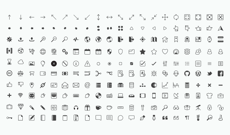
The whole icon font from IcoMoon. Web-friendly.
![]()
This work is licensed under a Creative Commons Attribution 4.0 International License.